






This post may contain affiliate links. Please read my disclosure policy.
In This Article Show
Some colors stop working after fifty, and it is not your imagination. Skin loses a little pigment and contrast over the years, hair often lightens or turns gray, and shades that once looked soft and pretty can start to pull the color out of your face, leaving you looking tired even on a good day.
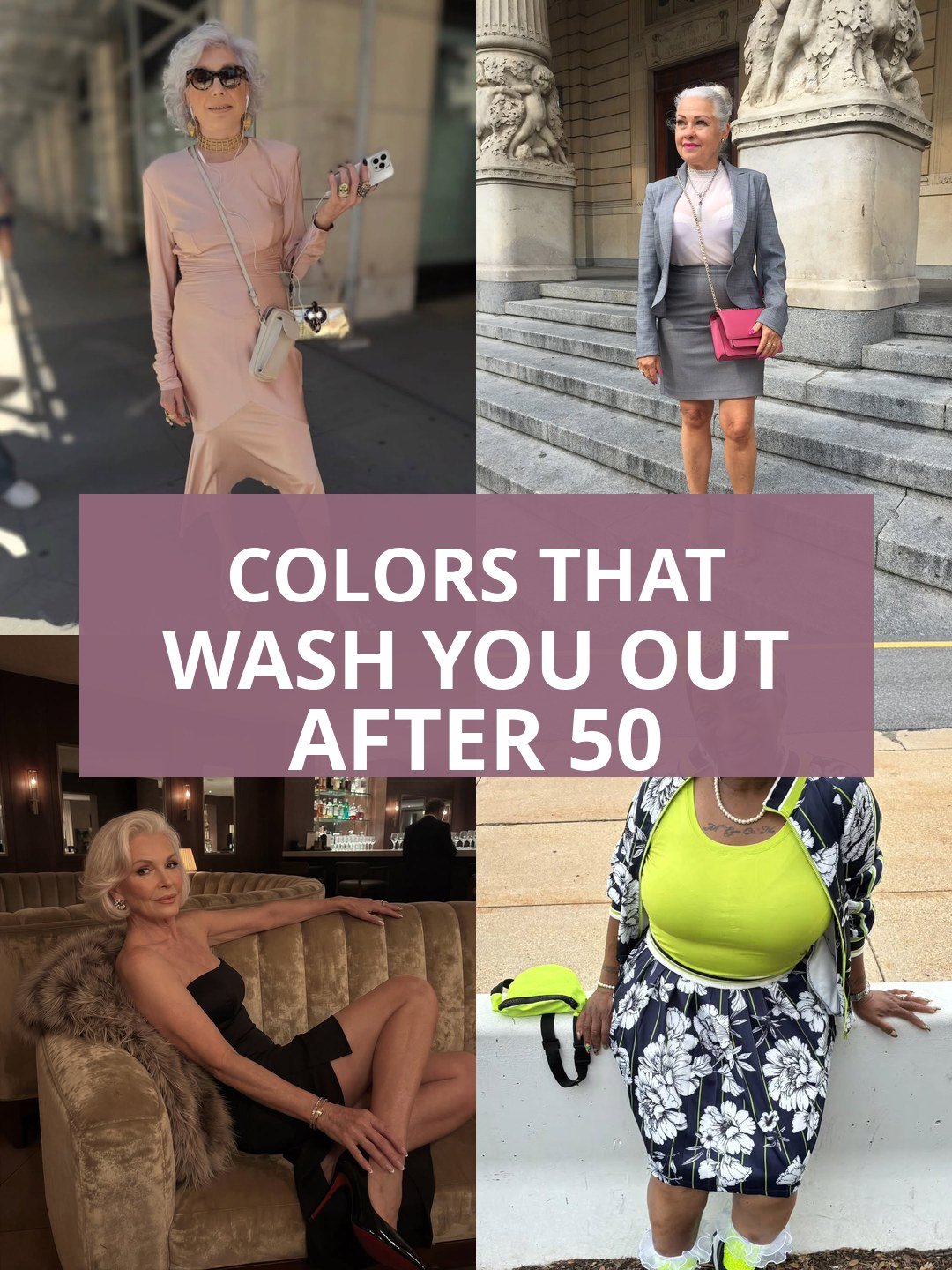
Every photo in this guide shows a real woman over fifty wearing one of the tricky shades herself, so you can judge honestly how each color sits against mature skin. Nothing here is banned. Every shade has a rescue, and each idea ends with what to wear instead, because the goal is a wardrobe that lights you up, not a list of rules that frightens you.
Below are the ten colors that wash women out most often after fifty, from icy pastels to head to toe black. Some will surprise you, and a few may be hanging in your closet right now, quietly explaining a hundred bad photos.
Short on time? Start with the quick picks, which are the swap in shades that almost never fail, then run the five fixes before you give anything away. Most washing out colors can be rescued in one small move.
Quick Picks: The Swap In Shades
- Best swap for black: a navy fit and flare midi dress, all the polish with none of the harshness
- Best swap for stark white: a cream knit sweater, warm and soft against the face
- Best swap for pastels: an emerald green shirt dress, rich color that gives energy back
Five Fixes When a Color Washes You Out
- Move the shade away from your face, wearing it as trousers, a skirt or a bag, and put a flattering color at your neckline instead.
- Add contrast at the neck, with a darker scarf, a bold necklace or a collar in a deeper shade, so your face gets a frame.
- Choose the deeper version of the same color family, sapphire over powder blue, berry over dusty mauve, emerald over mint.
- Let lipstick and blush do honest work, because a washing out shade often only needs the color put back on your lips and cheeks.
- Test every suspect color in daylight by a window, since pale shades lie the most under warm shop lighting.
1. Icy Pastel Pink, Pretty on the Hanger, Tiring on the Face
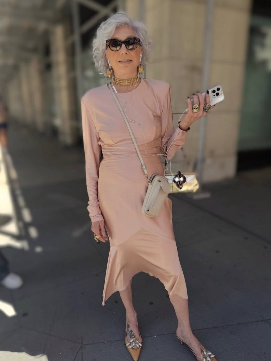
Icy pastel pink looks so fresh in the shop that it is hard to believe it can tire a face out, yet on warm or olive skin this blue based whisper of a color often does exactly that, echoing nothing in the skin and leaving it looking gray by comparison. This pale pink dress on a silver haired woman shows the effect kindly, pretty dress, muted face. The fix is warmth and depth. Coral, warm rose and rich berry all give the pink family back its life, and they flatter the same outfits pastel pink wanted to join.
Best for: Wear coral, warm rose or berry instead near your face, and keep icy pink for skirts, trousers and bags if you love it.
2. Stark Bright White, the Shade That Can Outshine You
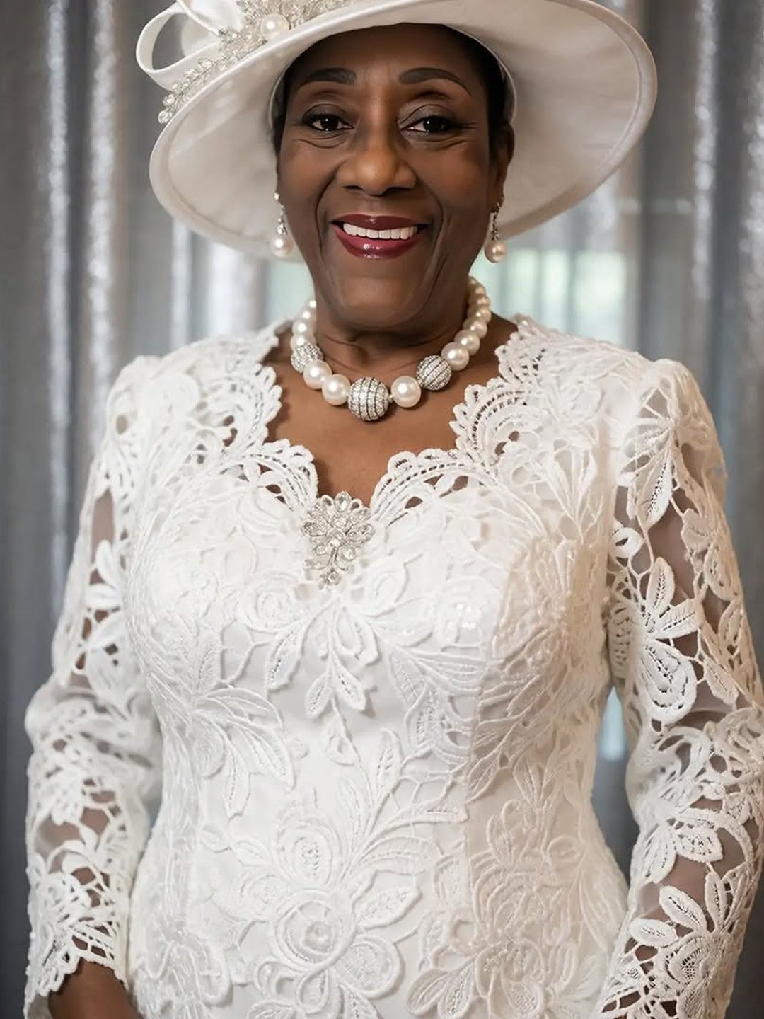
Pure bright white has a blue edge to it, and worn head to toe it can outshine mature skin completely, making the face look shadowed and tired while the outfit takes every compliment. This elegant white lace dress and hat show how much presence the shade has, and how quietly the face can fade behind it, even with pearls helping. The rescue is simple softness. Cream, ivory and warm white carry the same freshness with the glare removed, and deep or warm skin that loves bright white can keep it and add a stronger lipstick to hold its own.
Best for: Wear cream or ivory instead if your skin is warm or soft, or keep the white and add contrast with lipstick, darker jewelry or a colored scarf at the neck.
3. Ash Gray, the Color That Mirrors Tired Skin

Ash gray is the shade most likely to be blamed for a bad day, because it sits so close to the tones skin shows when it is tired, shadowed under the eyes, pale around the mouth. Worn head to toe like this tailored gray suit, it can flatten gray hair and grayish skin into one long sigh, and only her pink bag is pushing back. The fix is contrast and depth. Charcoal behaves better than ash, navy better still, and one strong accessory, a red lip, a bright scarf, a bold bag, breaks the gray spell at once.
Best for: Wear charcoal or navy instead for your main pieces, or rescue gray with one strong color at the neck or in your hand, exactly as her pink bag does here.
4. Powder Blue, Soft in the Wrong Way

Powder blue feels gentle and ladylike, which is why so many women reach for it, but its icy lightness can drain warm and medium skin, leaving the face looking washed and a little blue around the edges. This powder blue satin dress shows the trade clearly, lovely color, quiet face, even with good light and a smile. Blue is not the problem, the paleness is. Sapphire, cornflower and rich teal based blues all keep the family feeling while giving the face something to answer, and they are the blues that photograph kindly after fifty.
Best for: Wear sapphire, cornflower or teal instead near your face, and save powder blue for accessories or pieces below the waist.
5. Beige That Melts Into Your Skin
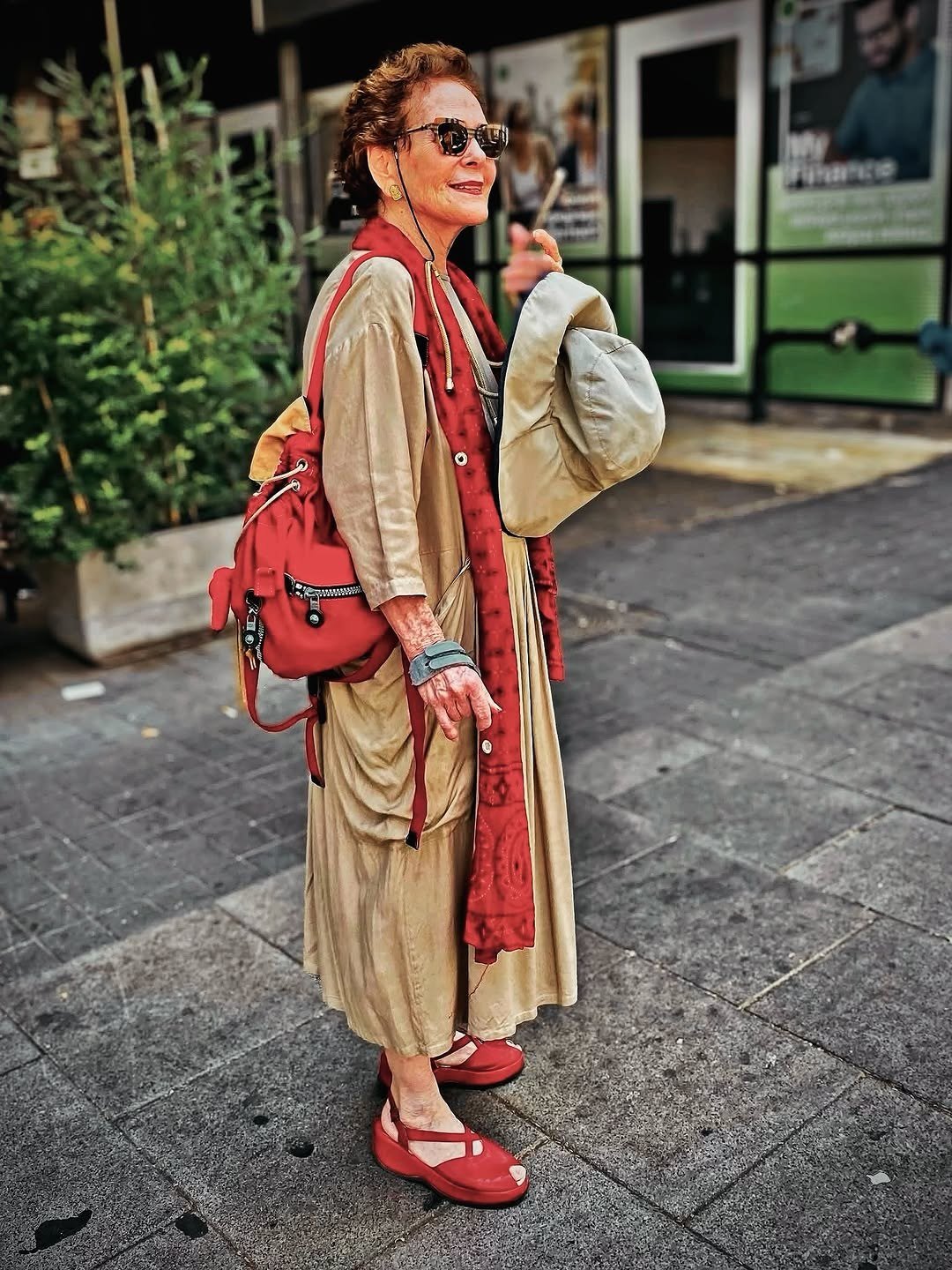
Beige fails in a quieter way than the pastels. When a beige sits too close to your own skin tone, the whole outline of you softens and blurs, and the face loses its edges, which reads as tiredness in photos. This loose beige dress would melt completely without help, and notice what saves it, a strong red scarf at the neck and red sandals giving the outfit its pulse. The deeper fix is camel, which is beige with the warmth and depth put back in, or any beige worn with one clear, strong color close to the face.
Best for: Wear camel instead of skin close beige, or do what she does and add one bold color at your neck, because beige needs a rescuer.
6. Head to Toe Black, Chic but Unforgiving

Black is the color women defend hardest, and this glamorous black dress on a white haired woman shows why, it can look stunning. The honest catch is contrast. After fifty, black worn close to the face can deepen every shadow, sharpen every line and pull the warmth out of the skin, especially in daylight and in photos. It asks your face to do all the work alone. Navy, charcoal and chocolate brown offer the same slim, serious mood with a far kinder edge, and black kept below the waist or broken by skin, jewelry or a scarf keeps its drama without the cost.
Best for: Wear navy, charcoal or chocolate instead for dresses near your face, or keep your black and break it with gold jewelry, a V neckline or a warm scarf.
7. Neon Shades, Louder Than Your Face

Neon does not wash you out by weakness but by volume. A fluorescent top like this neon yellow one shouts so loudly that the face becomes the quietest thing in the picture, and mature skin, which has less natural contrast to fight back with, simply disappears behind the glare. The color is fun, and fun is allowed, but it belongs in small doses after fifty. Jewel brights are the grown up answer, emerald, sapphire, ruby and magenta are just as joyful, with the depth that lets your face stay in the conversation.
Best for: Wear jewel brights instead for your main pieces, and keep neon to a bag, a scarf, nails or one small accent where its sparkle cannot outshout you.
8. Dusty Mauve, the Muddy Middle

Dusty mauve sits in the muddy middle of the color world, not pink, not purple, not gray, and that indecision is exactly what it lends to the face. On mature skin it can echo sallowness and make the whole picture look faded, as this mauve dress and capelet show, pretty shape, draining shade. The rescue lives in the same family with the dust shaken off. Clear plum, berry and rich amethyst keep the purple pink mood while restoring the depth that flatters, and they pair with the same gray, navy and black pieces mauve wanted to wear.
Best for: Wear clear plum, berry or amethyst instead, the same color story with the dust removed and the depth put back.
9. Icy Mint, Fresh on Ice Cream, Cold on Skin
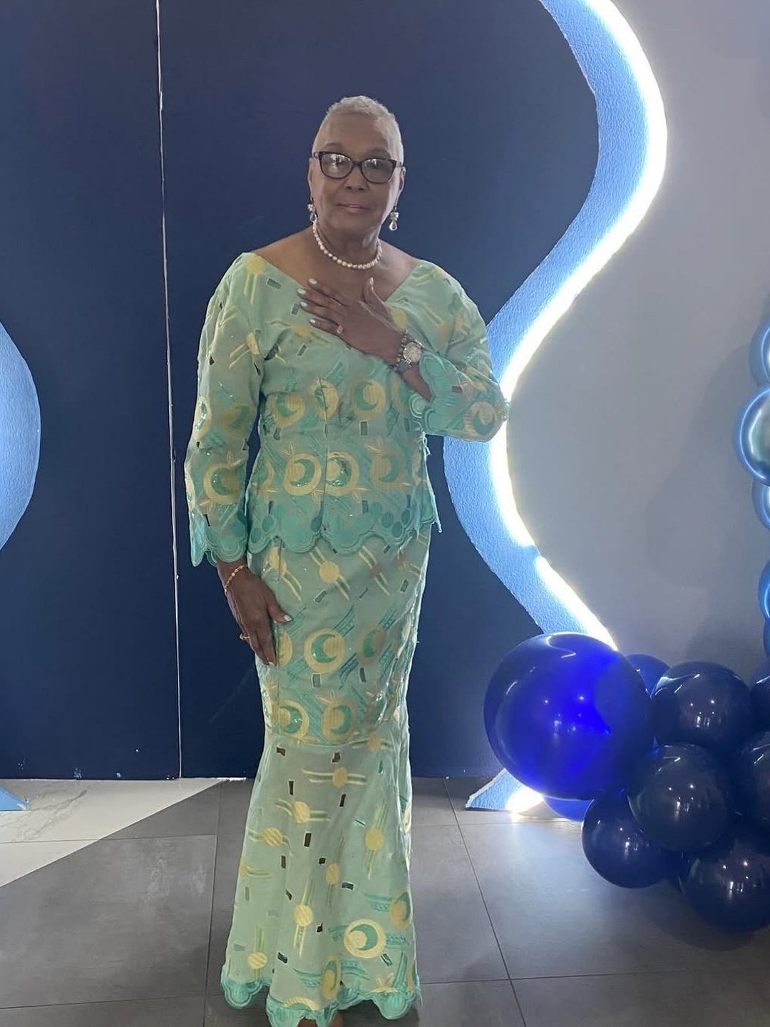
Mint looks like spring itself, which makes its effect on mature skin a real disappointment for many women. The icy blue green pales the face, argues with warm undertones and can make even good skin look chilly and tired, pearls or no pearls, as this mint gown shows. Green is a wonderful family after fifty, it is only the ice that fails. Teal, emerald and jade keep the freshness with far more depth, and they flatter warm skin, cool skin and every gray and silver head of hair between them.
Best for: Wear teal, emerald or jade instead near your face, and let mint live in small summer accessories if you cannot give it up.
10. Cream and Off White, Wrong for Cool Skin

Here is the twist most guides skip. Cream is the hero swap for warm skin, but on cool, pink toned skin it can be the villain, its yellow base clashing with pink undertones and making the face look sallow and tired. This cream shirt worn with a navy hat and leopard band shows the rescue already in place, cool navy and strong pattern giving her face the contrast the cream cannot. If your skin is cool, your white is the stark one from idea two, worn the other way round, and cream belongs further from your face or with navy beside it.
Best for: Wear bright white instead if your skin is cool and pink toned, or copy her trick and pair cream with navy and one strong pattern near the face.
Frequently Asked Questions
Why do some colors wash me out more after 50?
Because the contrast you were born with softens. Skin loses some pigment and glow, lips fade a little and hair often lightens or goes gray, so the frame around your face gets quieter. Low contrast colors, icy pastels, ash gray, skin close beige, mirror that quietness and the face fades with them. Deeper, clearer colors put the contrast back, which is why rich shades so often look better after fifty than they did at thirty.
How can I tell if a color is washing me out?
Hold the color under your chin in daylight by a window and look honestly. If the shadows under your eyes deepen, your lips seem to vanish or your skin takes on a gray or yellow cast, the color is washing you out. If your eyes look brighter and your skin smoother, it is a friend. A phone photo in the same light, no filter, tells the truth even faster than the mirror.
Do I have to throw out clothes in these colors?
Almost never. Wear the tricky shade below the waist where it cannot drain your face, layer a flattering color at your neckline over it, or add the fixes from this guide, a contrast scarf, a bold necklace, a proper lipstick. The colors in this list are only a problem in one place, right next to mature skin with nothing to help them. Styled with intent, nearly all of them can stay.
What if black is my favorite color?
Keep it, and wear it smartly. Black below the waist asks nothing of your face. Black near the face works better with a lower neckline, warm or shiny jewelry at the throat, a scarf in a rich color or stronger makeup than usual. Many women also find that softening just one black staple, the dress or coat that frames the face, into navy or charcoal changes every photo while the rest of the black wardrobe stays untouched.
Which colors almost never wash anyone out?
Teal leads the list, because its mix of blue and green suits warm, cool and neutral skin alike. Emerald, rich navy, true red, sapphire and deep berry are close behind, and camel flatters warm skin the way charcoal flatters cool skin. If you are rebuilding a wardrobe after fifty, anchor it in those shades and use the tricky colors in this guide as accents, far from the face or with a fix beside them.
Can makeup fix a color that washes me out?
Partly, and it is a fair tool. Lipstick restores the mouth that a pale shade erases, blush returns the color a draining shade steals, and a little definition at the eyes replaces lost contrast. But makeup is repainting what the color removed, and on busy days most women would rather the outfit did that work. The happiest answer is both, flattering colors as your base, and makeup for polish rather than rescue.
Final Thoughts on Colors That Wash You Out After 50
No color in this guide is forbidden, and no woman over fifty needs a frightening list of rules. These ten shades simply ask more of your face than it should have to give, and each one has a kinder cousin, cream for stark white, sapphire for powder blue, teal for mint, navy for black, waiting in the same color family.
Test your suspects in daylight, move the tricky ones away from your face or give them a contrast partner, and build your closet around the rich, clear colors that hand the light back to you. After fifty, the right color is not vanity. It is the simplest form of looking like yourself on a good day.